 NookMallow
The practical guides · Color & materials
How to Choose a Room Color Palette from What You Already Own
Begin with the surfaces that stay. Then choose a few supporting colors you can test in your actual light.
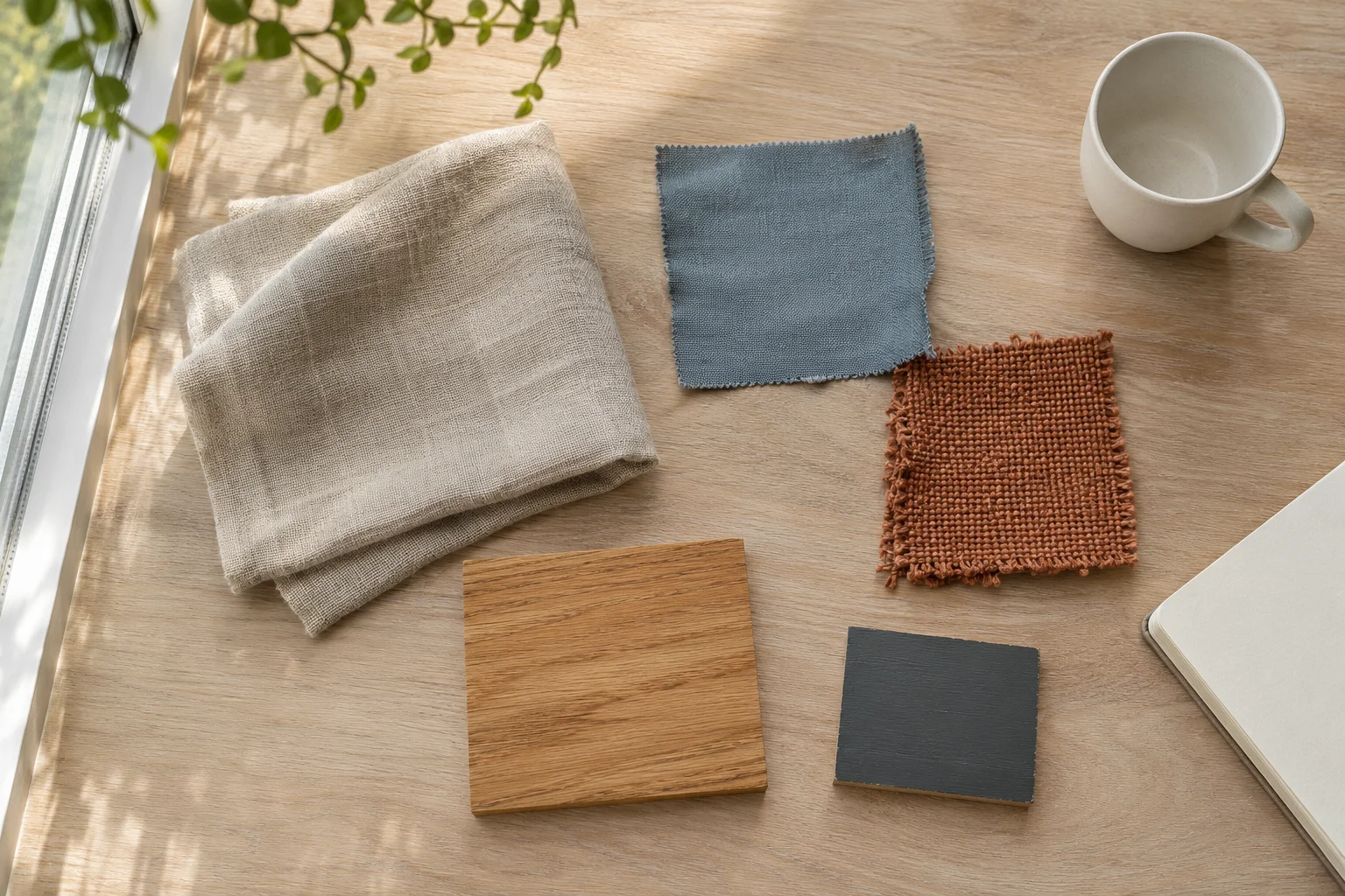
Choosing colors is easier when you stop treating the room as an empty page. Flooring, a sofa, a favorite print and the daylight already establish part of its palette. New textiles and smaller furniture need to work with that starting point.
The aim is not to reproduce a set of color codes perfectly. It is to create a room whose larger surfaces feel settled and whose smaller accents have a reason to be there.
01 / Color & materials
Inventory the colors that cannot easily change
Photograph the room in ordinary daylight and list the largest visible surfaces: floor, wall, sofa or bed, curtains and substantial storage. Note which are staying. A warm timber floor occupies more visual space than a small cushion, so it deserves a place in the decision even if you would not have chosen it.
Look for undertones rather than relying only on names. Two beige fabrics can lean pink and yellow; two grays may look different beside the same floor. A photograph helps you notice the overall balance, but a screen’s brightness and color settings cannot confirm a physical match.
02 / Color & materials
Assign roles before adding more colors
Choose a main background, a supporting tone and a smaller accent. The diagram uses warm linen as the background, slate blue as a supporting textile and clay as an accent, with the retained oak and a little charcoal giving structure. These are example roles, not mandatory percentages.
Give stronger colors somewhere to repeat. A small rust accent might appear in a cushion and part of an artwork, while a blue textile relates to a detail in the rug. Repetition can be subtle. You do not need an accessory in every color on every surface, and meaningful personal objects can remain outside the scheme.
- Background: the quieter surfaces that take up space.
- Support: a color or material that connects the main pieces.
- Accent: a smaller note that adds emphasis.
- Structure: retained timber, metal or a darker outline.
On a small screen, swipe across the worksheet.
Start with what stays.
- Flax
- Background
- Slate blue
- Supporting color
- Clay
- Small accent
- Retained oak
- Starting point
- Charcoal
- Structure
03 / Color & materials
Test the palette in more than one light
Put available samples beside the retained furniture and floor rather than viewing them in isolation. Check them during the day and under the lamps you actually use at night. Move them from the window to the darker side of the room. A pleasing combination in one photograph may feel different across the real space.
If you cannot obtain samples, start with a smaller, returnable purchase whose terms you understand. Keep packaging while you check the color at home. Product photography is a useful starting reference, but it cannot guarantee the appearance of texture, sheen or dye in your room.
A palette is a set of relationships, not a demand that everything match.
04 / Color & materials
Use pattern and texture to make the palette livable
A room in a small color range does not need every surface to be plain. Compare a smooth timber top with a coarse woven cushion, or a narrow stripe with a quieter rug. Varying texture can create depth without introducing another competing color.
Choose a pattern you enjoy and let it carry several tones together. Then simplify nearby surfaces so it has room to read. If the result feels busy, remove one pattern or high-contrast accent before deciding that the whole palette is wrong. Take a fresh photo after the change and compare the overall room, not just the shopping items.
05 / A few useful answers
Before you make the next choice.
Do I need to follow a 60–30–10 color rule?
No. It can be a rough composition prompt, but the room’s fixed surfaces, furniture and your preferences matter more than exact percentages.
Can warm and cool colors work together?
Yes. Compare their undertones and the amount of each that is visible. Test the combination in your room rather than treating warm and cool as incompatible categories.
Start with your room
Make the next choice yours.
Share your room photos, tell us what stays and set your furniture budget. Find real product options and use an AI preview to explore the direction.
Find furniture for your room Confirm dimensions, availability and delivery at the store. Shipping and tax are separate.